{shiny} is powered by Bootstrap, the main components are personalizable using a large number of variables. Below, we give some examples of parameters that you can modify to change the appearance of elements created by {shiny} functions.
Buttons
Buttons and their variants can be modified by variables from
bs_vars_button(). Here we create square buttons with bold
labels and custom colors:
{shiny} code:
buttons <- tagList(
  actionButton(
    "default", "Default"
  ),
  actionButton(
    "primary", "Primary",
    class = "btn-primary"
  )
)
{fresh} variables:
bs_vars_button(
  font_weight = 500,
  border_radius_base = 0,
  default_color = "#112446",
  default_border = "#112446",
  primary_color = "#FFF",
  primary_bg = "#112446",
  primary_border = "#112446"
)
With default theme, it will render as:
With our {fresh} theme it will look like:
Status
Buttons like several components in Bootstrap are styled wit statuses
colors, there’s 5 options: primary, success, danger, warning and info.
It’s possible with bs_vars_color() to modify theses colors
to alter all components depending on them:
{shiny} code:
btn <- function(x)
  actionButton(
    x, x,
    class = paste0("btn-", x)
  )

colors <- tagList(
  btn("primary"),
  btn("success"),
  btn("info"),
  btn("warning"),
  btn("danger"),
  tags$p(""),
  shinyWidgets::progressBar(
    "pb1", value = 80,
    status = "primary",
    display_pct = TRUE
  )
)
{fresh} variables:
bs_vars_color(
  brand_primary = "#112446",
  brand_success = "#7bc043",
  brand_info = "#0392cf",
  brand_warning = "#f37736",
  brand_danger = "#ee4035"
)
With default theme, it will render as:
With our {fresh} theme it will look like:
Navbar
If you use shiny::navbarPage, you can customize colors
with bs_vars_navbar():
{shiny} code:
navbar <- navbarPage("App Title",
  tabPanel("Plot"),
  tabPanel("Summary"),
  tabPanel("Table")
)
{fresh} variables:
bs_vars_navbar(
  padding_horizontal = "15px",
  default_bg = "#112446",
  default_color = "#FFFFFF",
  default_link_color = "#FFFFFF",
  default_link_active_color = "#FFFFFF",
  default_link_hover_color = "#A4A4A4"
)
With default theme, it will render as:
With our {fresh} theme it will look like:
wellPanel
In {shiny}, wellPanel create a box with a grey
background, it’s also used in sidebarPanel(), you can
change these default settings with bs_vars_wells():
{shiny} code:
well <- wellPanel(
  "This is a wellPanel (or sidebarPanel)"
)
{fresh} variables:
bs_vars_wells(
  bg = "#FFF",
  border = "#3f2d54"
)
With default theme, it will render as:
With our {fresh} theme it will look like:
Global
bs_vars_global() allow to define some global options
like background and text color, but also the number of columns in the
grid system (when using fluidRow) :
{shiny} code:
grid <- tagList(
  fluidRow(
    tags$div(
      class = "col-sm-15",
      wellPanel("width=15 - 2 columns")
    ),
    tags$div(
      class = "col-sm-15",
      wellPanel("width=15 - 2 columns")
    )
  ),
  fluidRow(
    tags$div(
      class = "col-sm-10",
      wellPanel("width=10 - 3 columns")
    ),
    tags$div(
      class = "col-sm-10",
      wellPanel("width=10 - 3 columns")
    ),
    tags$div(
      class = "col-sm-10",
      wellPanel("width=10 - 3 columns")
    )
  ),
  fluidRow(
    column(width = 6, wellPanel("width=6 - 5 columns")),
    column(width = 6, wellPanel("width=6 - 5 columns")),
    column(width = 6, wellPanel("width=6 - 5 columns")),
    column(width = 6, wellPanel("width=6 - 5 columns")),
    column(width = 6, wellPanel("width=6 - 5 columns"))
  )
)
{fresh} variables:
bs_vars_global(
  grid_columns = 30,
  grid_gutter_width = "15px"
)
In the first two examples, we can’t use column because
it’s limited to a maximum width of 12.
With default theme, it will render as:
With our {fresh} theme it will look like:
Here we now have a grid system where it’s possible to have 5 columns.
tabPanel
Default tabPanel can be customized with
bs_vars_tabs(), if type = "pills" in
tabsetPanel, use bs_vars_pills(). Some options
are common to both and can be set in bs_vars_nav().
{shiny} code:
tabs <- tabsetPanel(
  tabPanel("Plot"),
  tabPanel("Summary"),
  tabPanel("Table")
)
{fresh} variables:
bs_vars_tabs(
  border_color = "#112446",
  active_link_hover_bg = "#FFF",
  active_link_hover_color = "#112446",
  active_link_hover_border_color = "#112446",
  link_hover_border_color = "#112446"
)
With default theme, it will render as:
With our {fresh} theme it will look like:
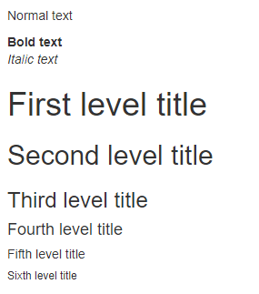
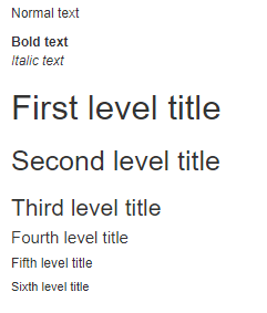
Font size
Font size can be set with bs_vars_font, the argument
size_base is the base font size, meaning that other sizes
are calculated from this value, nonetheless you set absolute size for
headings if you want.
{shiny} code:
font <- tagList(
  tags$p("Normal text"),
  tags$b("Bold text"),
  tags$i("Italic text"),
  tags$h1("First level title"),
  tags$h2("Second level title"),
  tags$h3("Third level title"),
  tags$h4("Fourth level title"),
  tags$h5("Fifth level title"),
  tags$h6("Sixth level title")
)
{fresh} variables:
bs_vars_font(
  size_base = "12px"
)
With default theme, it will render as:
With our {fresh} theme it will look like:
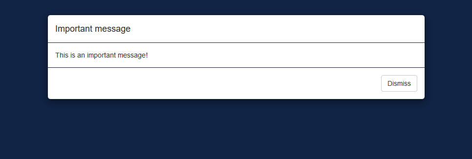
Modal
Modal create with modalDialog can be customized with
bs_vars_modal(), you can change the width of the window,
the overlay color behind the modal and its opacity.
For example, here’s a modal with 80% width and an opaque background:
bs_vars_modal(
  md = "80%",backdrop_bg = "#112446",
  backdrop_opacity = 1,
  header_border_color = "#112446",
  footer_border_color = "#112446"
)
With default theme, it will render as:
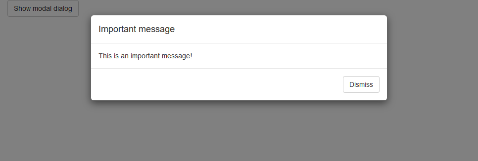
With our {fresh} theme it will look like: