Extend widgets available in shiny
Overview
This package provide custom widgets and other components to enhance your shiny applications.
You can replace classical checkboxes with switch button, add colors to radio buttons and checkbox group, use buttons as radio or checkboxes. Each widget has an update method to change the value of an input from the server.
Installation
Install from CRAN with:
install.packages("shinyWidgets")Or install the development version from GitHub with:
# install.packages("remotes")
remotes::install_github("dreamRs/shinyWidgets")
Demo
A gallery application is included in the package. Once installed, use the following command to launch it:
shinyWidgets::shinyWidgetsGallery()A live version is available here : http://shinyapps.dreamrs.fr/shinyWidgets
Widgets
Single checkbox
- Bootstrap switch
Turn checkboxes into toggle switches :
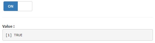
switchInput(inputId = "id", value = TRUE)- Material switch
Turn checkboxes into toggle switches :
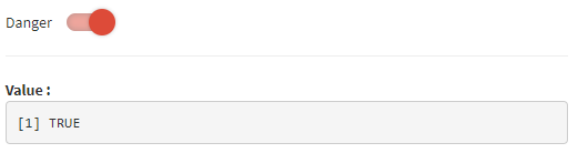
materialSwitch(inputId = "id", label = "Primary switch", status = "danger")- Pretty checkbox
prettyCheckbox(
  inputId = "id", label = "Check me!", icon = icon("check")
)- Pretty switch
prettySwitch(
  inputId = "id",
  label = "Switch:",
  fill = TRUE,
  status = "primary"
)- Pretty toggle
prettyToggle(
  inputId = "id",
  label_on = "Checked!",
  label_off = "Unchecked..."
)
Checkboxes and radio buttons
- Bootstrap buttons

checkboxGroupButtons( # or radioGroupButtons
  inputId = "id",
  label = "Choice: ",
  choices = c("A", "B", "C")
)- Pretty checkbox group and radio buttons
prettyCheckboxGroup( # or prettyRadioButtons
  inputId = "id",
  label = "Choice",
  choices = c("A", "B", "c"),
  outline = TRUE,
  plain = TRUE,
  status = "primary",
  icon = icon("check")
)
Select menu
- Bootstrap select picker
Select menu with lot of configurations options available:
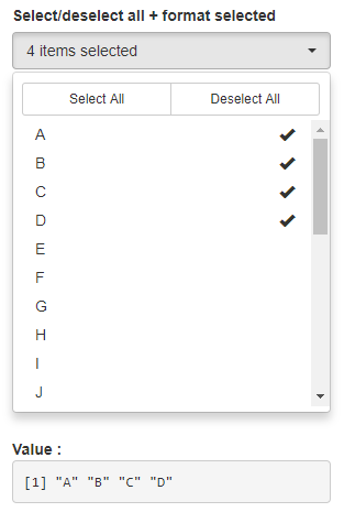
pickerInput(
  inputId = "id",
  label = "Select:",
  choices = month.name,
  options = pickerOptions(
    actionsBox = TRUE,
    size = 10,
    selectedTextFormat = "count > 3"
  ),
  multiple = TRUE
)- Virtual select
Select menu that can support long list of choices:
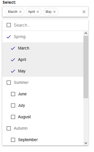
virtualSelectInput(
  inputId = "id",
  label = "Select:",
  choices = list(
    "Spring" = c("March", "April", "May"),
    "Summer" = c("June", "July", "August"),
    "Autumn" = c("September", "October", "November"),
    "Winter" = c("December", "January", "February")
  ),
  showValueAsTags = TRUE,
  search = TRUE,
  multiple = TRUE
)
Date picker
- Air Datepicker
Date (or month or year) picker with lot of options and a timepicker integrated :
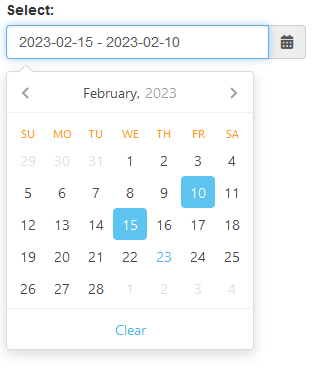
airDatepickerInput(
  inputId = "id",
  label = "Select:",
  placeholder = "Placeholder",
  multiple = 5,
  clearButton = TRUE
)
Sliders
- Slider with Text
Slider with strings, to pass whatever you want:
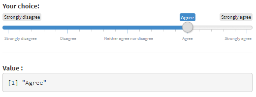
sliderTextInput(
  inputId = "id",
  label = "Choice:",
  grid = TRUE,
  force_edges = TRUE,
  choices = c(
    "Strongly disagree",
    "Disagree",
    "Neither agree nor disagree",
    "Agree",
    "Strongly agree"
  )
)- noUiSlider
A range slider that can be colored, have more than two handles and positioned vertically (among other things):
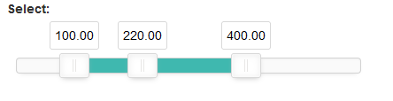
noUiSliderInput(
  inputId = "id",
  label = "Select:",
  min = 0,
  max = 600,
  value = c(100, 220, 400),
  tooltips = TRUE,
  step = 1
)
Tree
- Tree check
Select value(s) in a hierarchical structure:
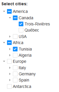
treeInput(
  inputId = "ID2",
  label = "Select cities:",
  choices = create_tree(cities),
  returnValue = "text",
  closeDepth = 1
)
Text
- Search
A text input only triggered by hitting ‘Enter’ or clicking search button :
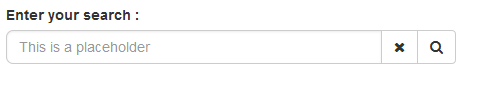
searchInput(
  inputId = "id",
  label = "Enter your search :",
  placeholder = "This is a placeholder",
  btnSearch = icon("search"),
  btnReset = icon("remove"),
  width = "100%"
)
Other functionnalities
Sweet Alert
Show an alert message to the user to provide some feedback, via sweetalert2 library:
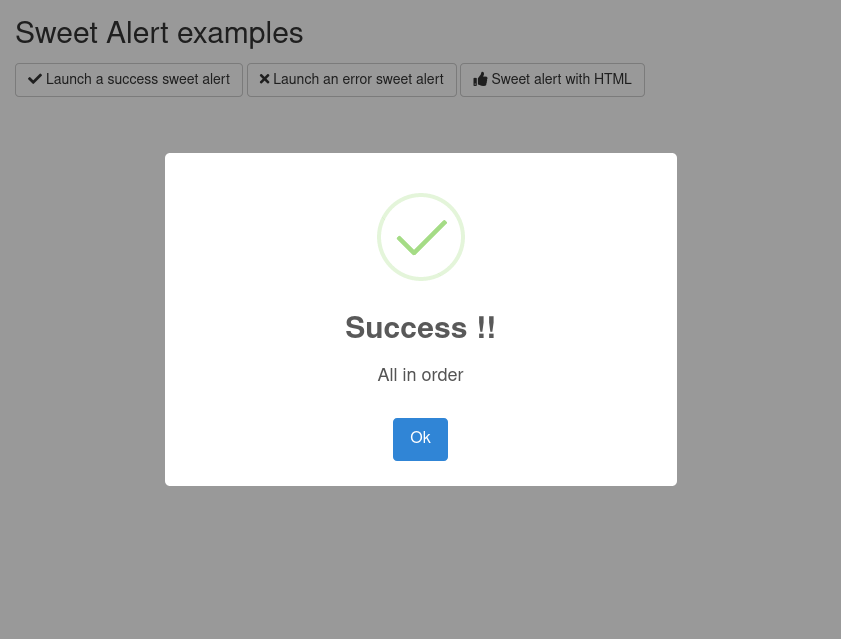
See examples in ?show_alert.
Request confirmation from the user :
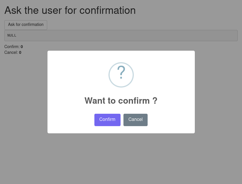
See examples in ?ask_confirmation.
Dropdown button
Hide input in a button : 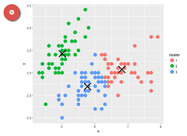
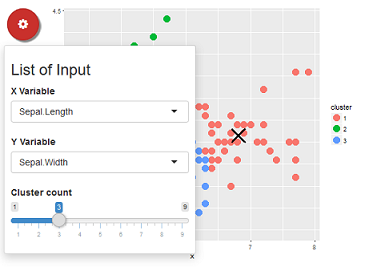
dropdownButton(
  tags$h3("List of Input"),
  selectInput(inputId = 'xcol', label = 'X Variable', choices = names(iris)),
  selectInput(inputId = 'ycol', label = 'Y Variable', choices = names(iris), selected = names(iris)[[2]]),
  sliderInput(inputId = 'clusters', label = 'Cluster count', value = 3, min = 1, max = 9),
  circle = TRUE,
  status = "danger",
  icon = icon("gear"), width = "300px",
  tooltip = tooltipOptions(title = "Click to see inputs !")
)
See also ?dropMenu()
Development
This package use {packer} to manage JavaScript assets, see packer’s documentation for more.
Install nodes modules with:
packer::npm_install()Modify inputs bindings in srcjs/inputs/, then run:
packer::bundle()Re-install R package and try functions.